Project delivered in Autumn 2018
MySense is a new company working in the healthcare and technology industries.
Their goal is to provide a better autonomy to their users, and, peace of mind for those around them.
Their main products are:
1
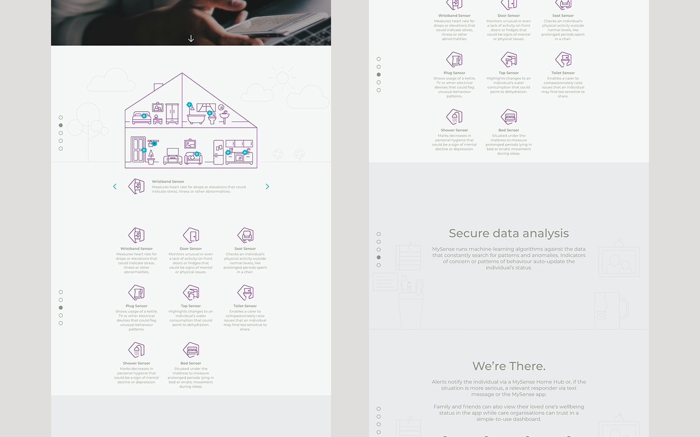
A group of sensors the user put into their home and wrist. The sensors are recording their routine as data and creating their daily pattern.
2
A software is compiling all those data in a visual way, allowing the user’ carer or family to know when the user health is decreasing.
MySense asked us to create a human but tech identity
(makes sense)
On the phase one we proposed different logos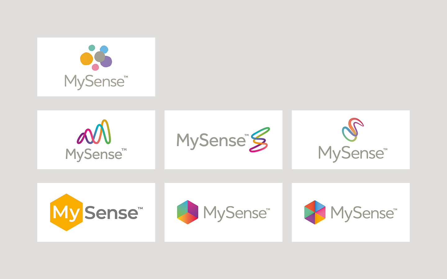
The row one is a galaxy of data, the human touch are the roughed corner.
The row two is exploring the curve created by the data.
The row three is featuring the five sense plus the sixth… their products.
After some discussions to refine what the client wanted to convey via their logo… one been chosen and some iterations been created.
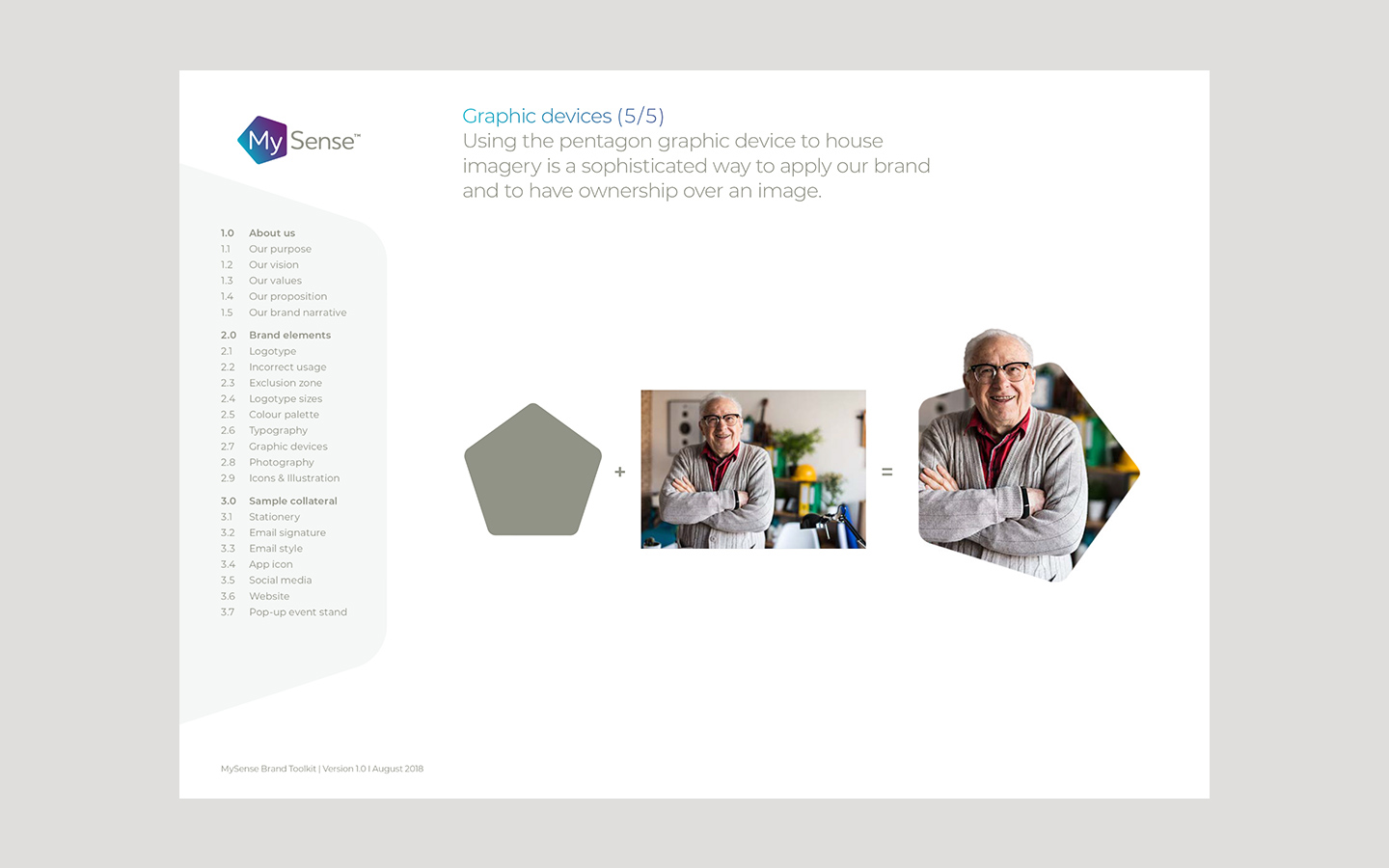
On this logo we changed the hexagon shape to a pentagon, as a reference to the user senses, the ‘My’ is placed into the pentagon to highlight the fact the user is the most important. The pentagon edges are rounded to avoid any negative association. ‘Sense’ is written in a neutral colour to create a balance with the pentagon, and the used font is a rounded one to impart a cocooning feeling.
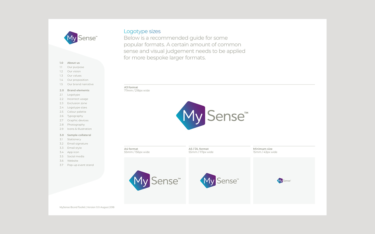
Along with the logo sets a whole brand guideline booklet been created.


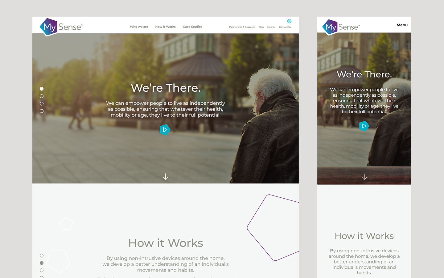
Another big part of the project was the creation of their website.
For the backend the dev team created a bespoke CMS, for the front end we decided (on the first version) to create a human focus website.
For the second version of the website, the approach was to push further the tech part of their product, the human touches was featured on the pictures and on the micro-interactions.
Each section is displayed on full screen.
(this below video is showing some interactions)
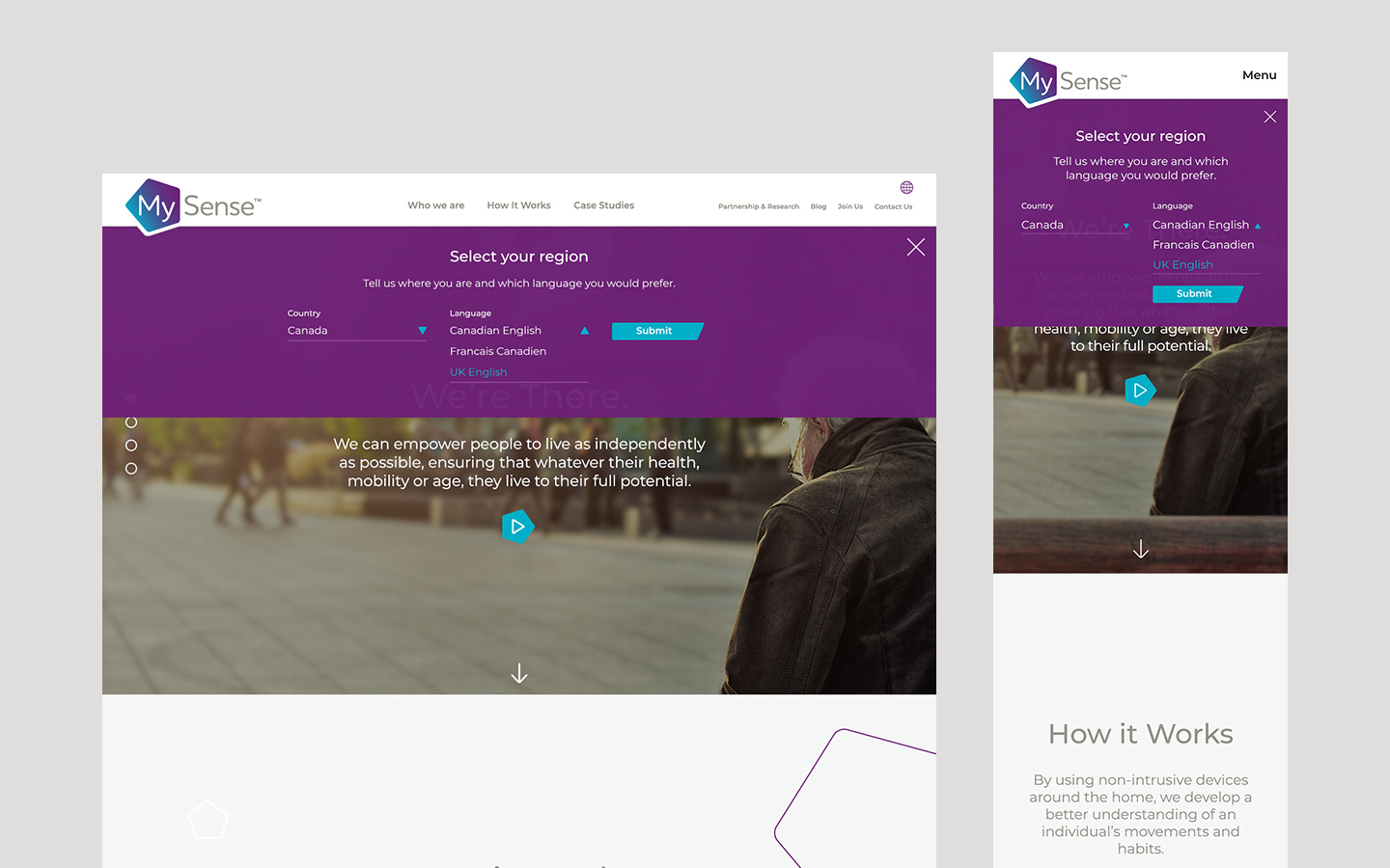
The open menu sections, Contact Us and Region selection:
Here are the different internal pages of the website.
1
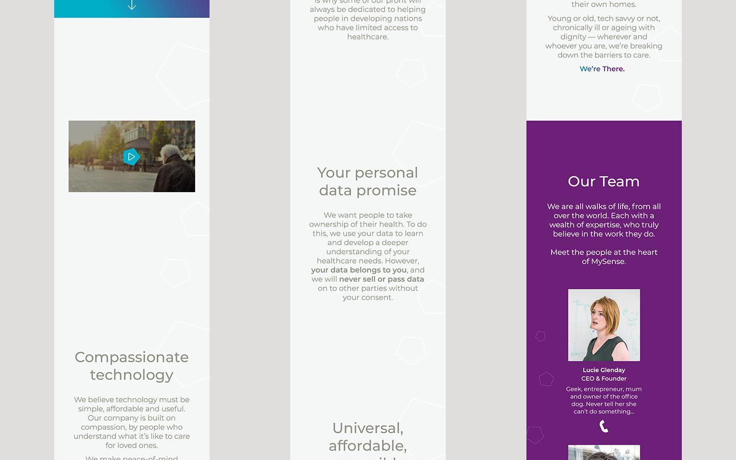
Who we are
(the gradient background is moving :) )
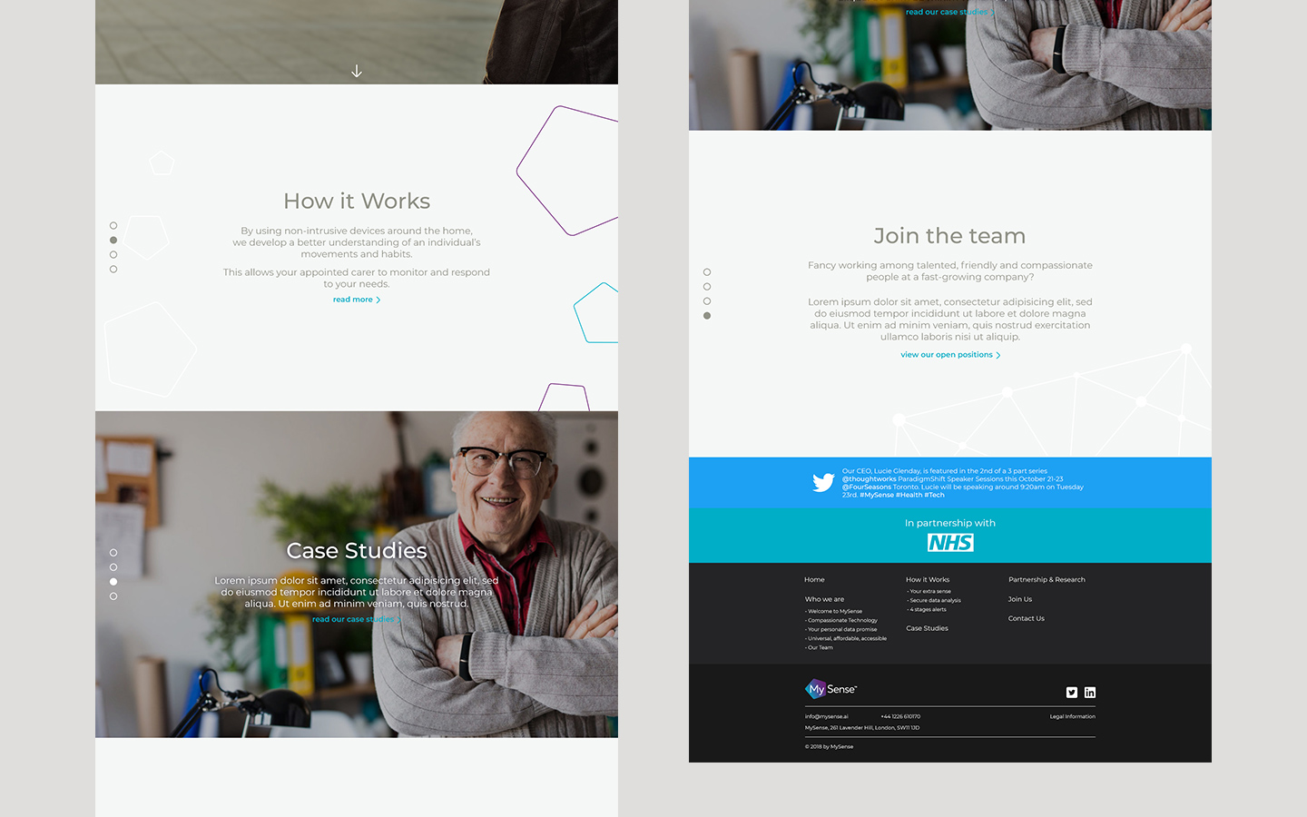
2
How it Works
(here we have a little bit of interaction, on the house graphic, if the user hover some of the pentagon the sensor description under the home graphic will change accordingly)

3
Case Studies

4
Partnership and Research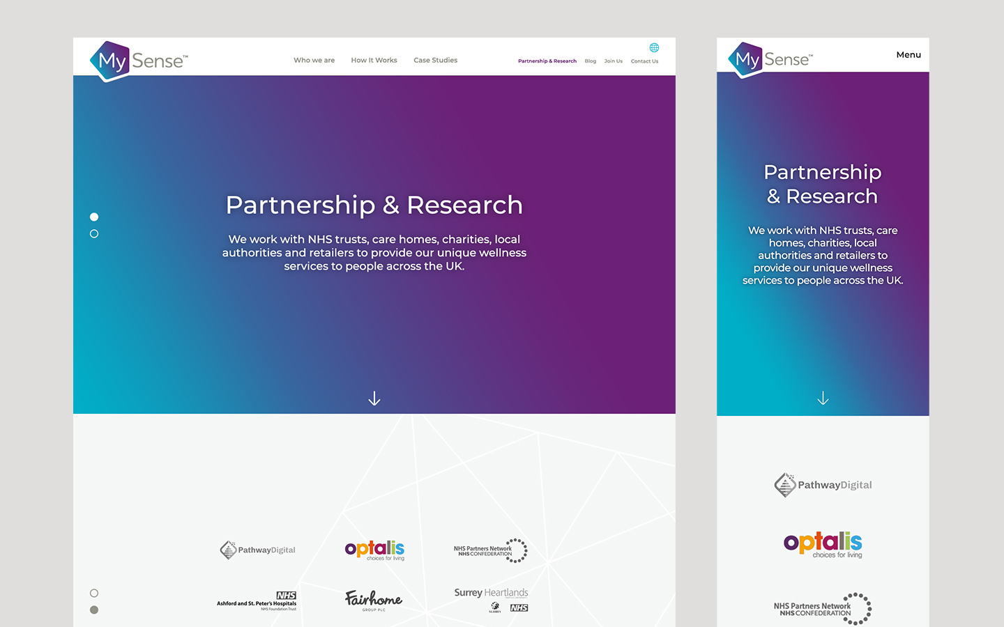
5
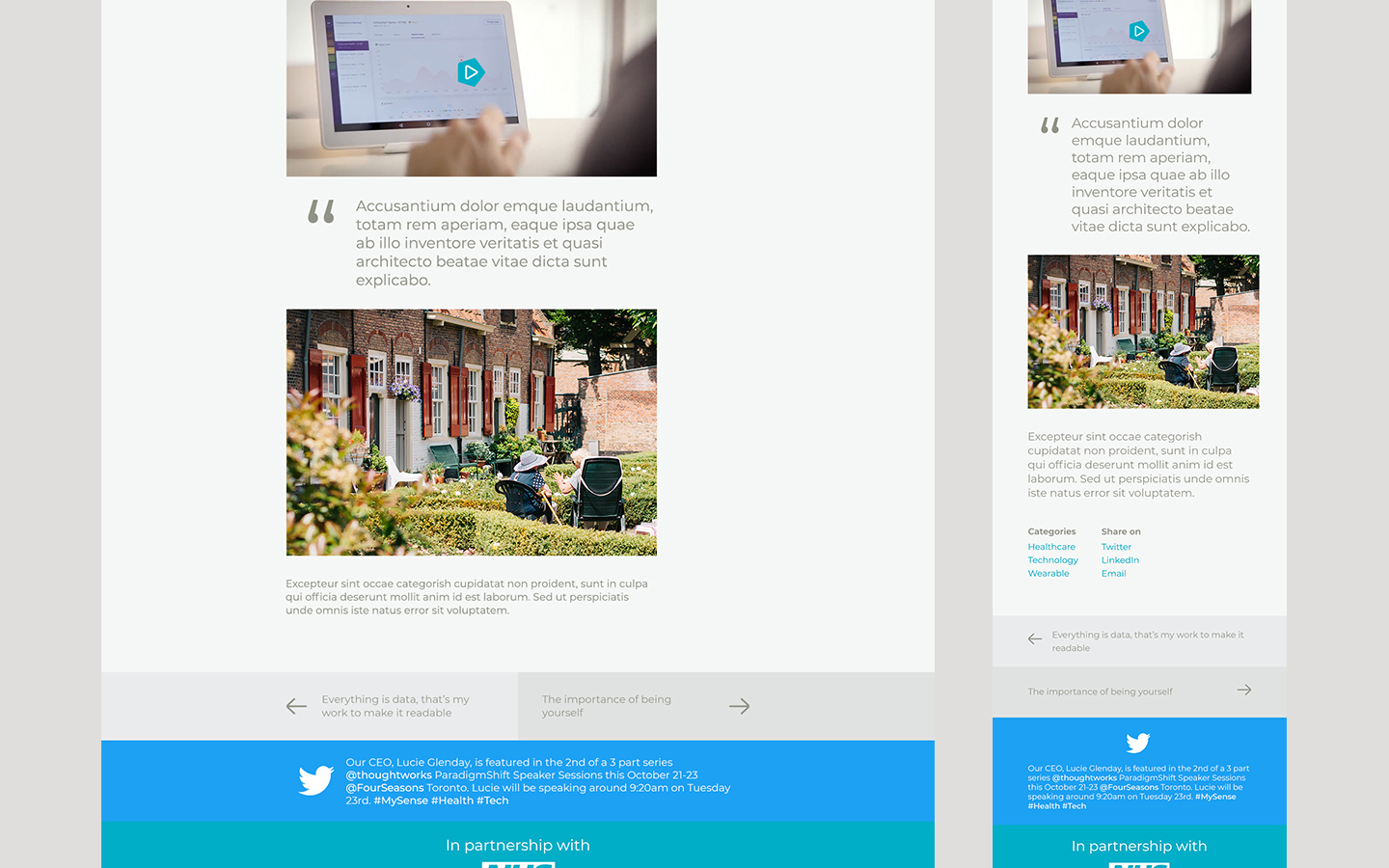
The Blog
(which is more an editorial part of the website, so the body copy is left aligned to ensure the user reading comfort)

Bonus, tiny interactions on hover state
+
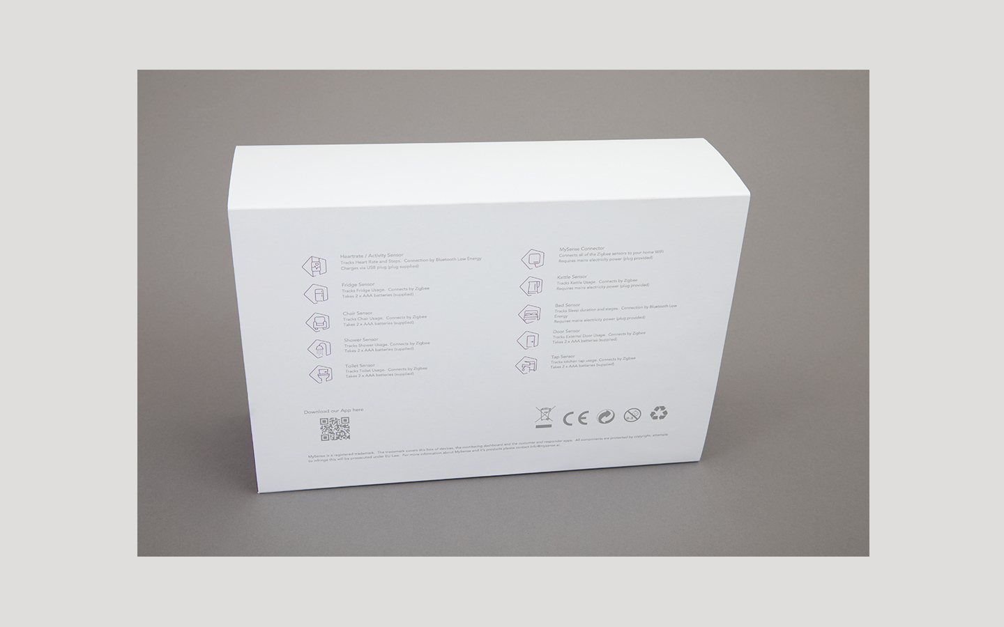
the product box
+
some social visuals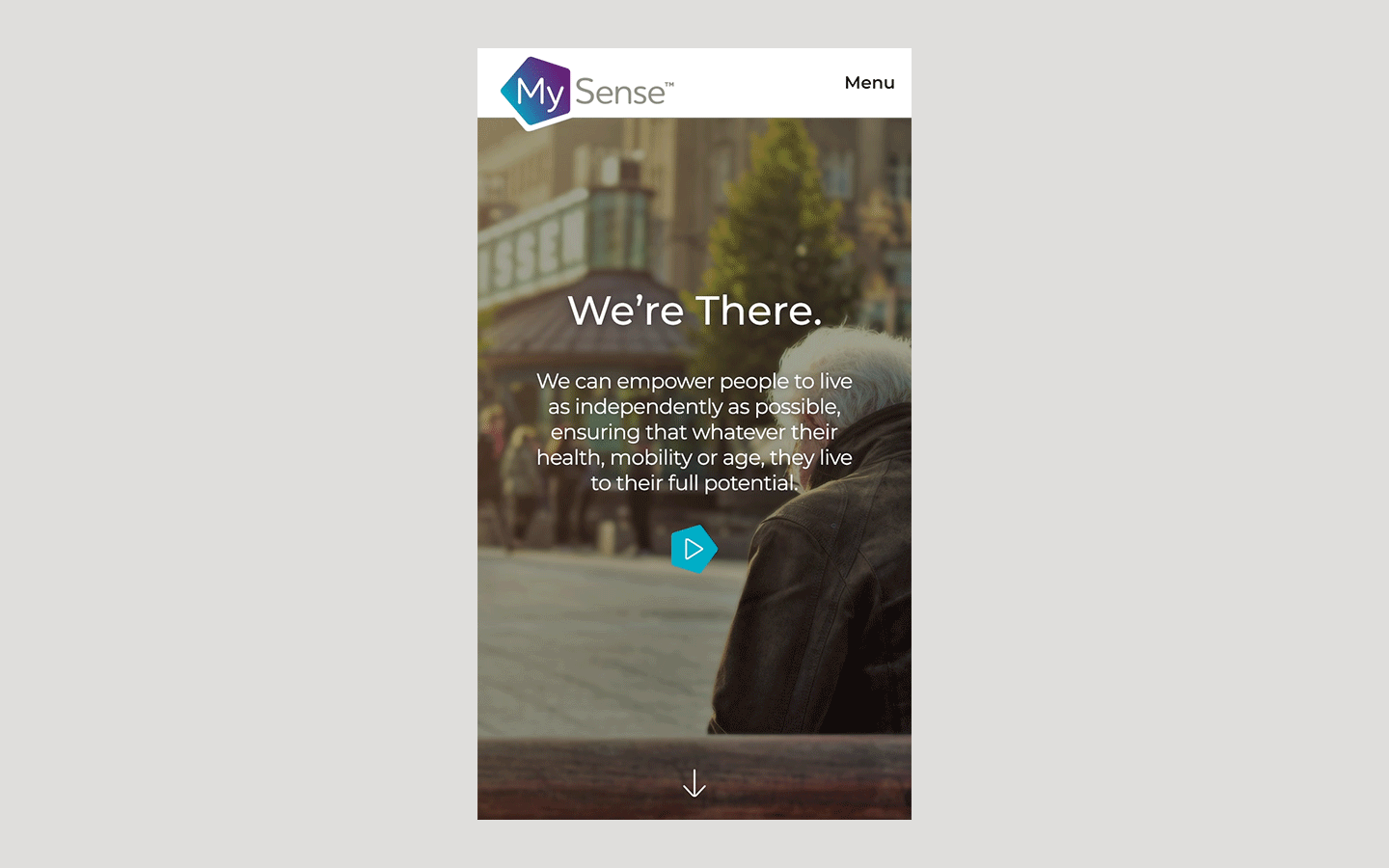


Thanks to the Jacob Bailey team for the hard work
:)
